
If you’ve ever wondered what your city looked like in the past, you can take a leaf out of Dan Vanderkam and Raven Keller’s books.
In 2011, software engineers Vanderkam and Keller created OldSF. This was a collection of photographs from the San Francisco Public Library that was plotted onto Google Maps. It all started because Vanderkam was looking for a photograph of his street and realised that the photograph he found in the library had been mislabelled. This led to the idea of plotting all the photographs on a map. They used 13, 000 photographs of San Francisco since 1850 for the project.
When the duo relocated to New York in 2015, Vanderkam spearheaded the OldNYC project and Keller helped out wherever he could.
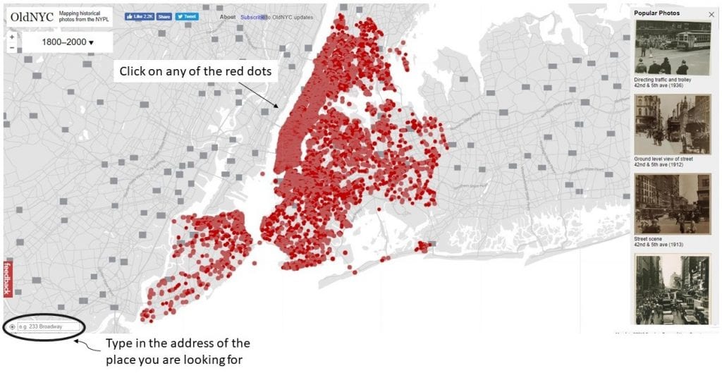
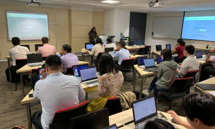
What you see when you first visit the site
Image source: Screengrab off OldNYC’s website
The photographs on OldNYC all came from the New York Public Library’s Milstein Collection. The New York City photograph collection began in the 1920s, with the aim of documenting the transformation of New York City, especially focusing on new building constructions and the tearing down and replacement of older buildings and infrastructures.
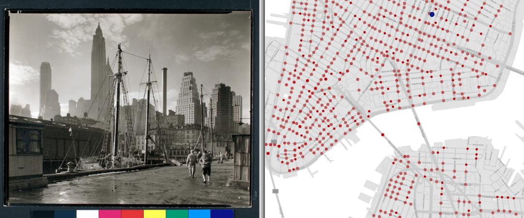
When Vanderkam undertook the project of digitizing these 40, 000 photographs, he made use of geocoding and optical character recognition. Geocoding (also known as associating latitudes and longitudes to the photographs) allowed the images to be placed at points on a map and created new ways of exploring this collection. The red dots in the image below represents different points on the map.

Visitors can click on any of the locations on the map to find photographs of that area from any time between 1800 to 2000. Image source: Screengrab off OldNYC’s website

When visitors click on individual photographs, more details of the location can be found. Image source: Screengrab off OldNYC’s website
The original photographs from the collection were presented on legal-size mounts, which enabled easy interfiling, eased research browsing and provided a space for additional information about the photograph to be recorded. From the mounts, the duo had to distinguish the individual photographs and extract them to ensure that the final sizes were standardised. You can read more about the process in the following posts:
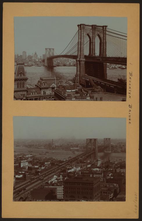
Irma and Paul Milstein Division of United States History, Local History and Genealogy, The New York Public Library. (1898 – 1900). Bridges – Brooklyn Bridge – [Manhattan – East River – Brooklyn.] Retrieved from http://digitalcollections.nypl.org/items/510d47dd-9045-a3d9-e040-e00a18064a99
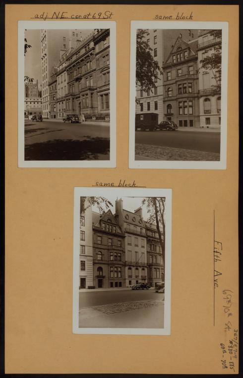
Irma and Paul Milstein Division of United States History, Local History and Genealogy, The New York Public Library. Manhattan: 5th Avenue – 69th Street Retrieved from http://digitalcollections.nypl.org/items/510d47dc-e7ef-a3d9-e040-e00a18064a99
The address of each location was written on the back of each photograph. Vanderkam used optical character recognition, also known as OCR, to digitize the addresses so that he would not have to record them manually. OCR is the conversion of images of typed, handwritten or printed text into machine-encoded text. It is a common method of digitising printed texts so that they can be electronically edited, searched, stored more compactly, displayed on-line. The methods he used are explained more explicitly on his blog:
Why this is relevant:
Mapping your data can help show and track trends (e.g. birth rates, migration rates etc.). The interactive format is an efficient way for people to easily understand and engage with information, and in this example, learn the history of a particular place. It would be extremely handy when it comes to presentations.
How to get started:
You do not necessarily have to have in depth technical skills such as the ones described above. You can create a similar map using StoryMapJS. Get started by exploring examples and tutorials in our resource post on the platform. All you need is your data and a Google account.
If you have found similar interesting projects such as this, share with us in the comments below!
Be sure to follow us on Twitter @NTUsgLibrary, and our hashtag #NTUsgLibraryDS for more interesting data visualization projects!
This post is co-authored by student assistant Sam Wen Xin and Digital Scholarship executive Nursyafiqah.


